
One of the key principles of interior design is visual weight or balance. This is where all the elements of the room such as colour, texture, lighting and furniture work together harmoniously and everything in the scheme feels in its place. ‘Successful visual weight in design is like a recipe, you add a bit of this and a bit of that and then it works,’ explains interior designer Sean Symington of Sean Symington Design. ‘Everyone, even people who aren’t designers, can tell when a room isn’t balanced.’
Part of the secret of getting the visual weight right is working on the function of the room first, according to Charmaine White of architect, interior design and landscape design studio HollandGreen. ‘I start to build a picture from the ground up and begin with the fixed elements first, so is the cabinetry being built in or is it going to be freestanding, and where is it going to go? Then I come to the fabrics, wallpaper and paint, where you can build in the character and the emotion in an interior,’ advises Charmaine.
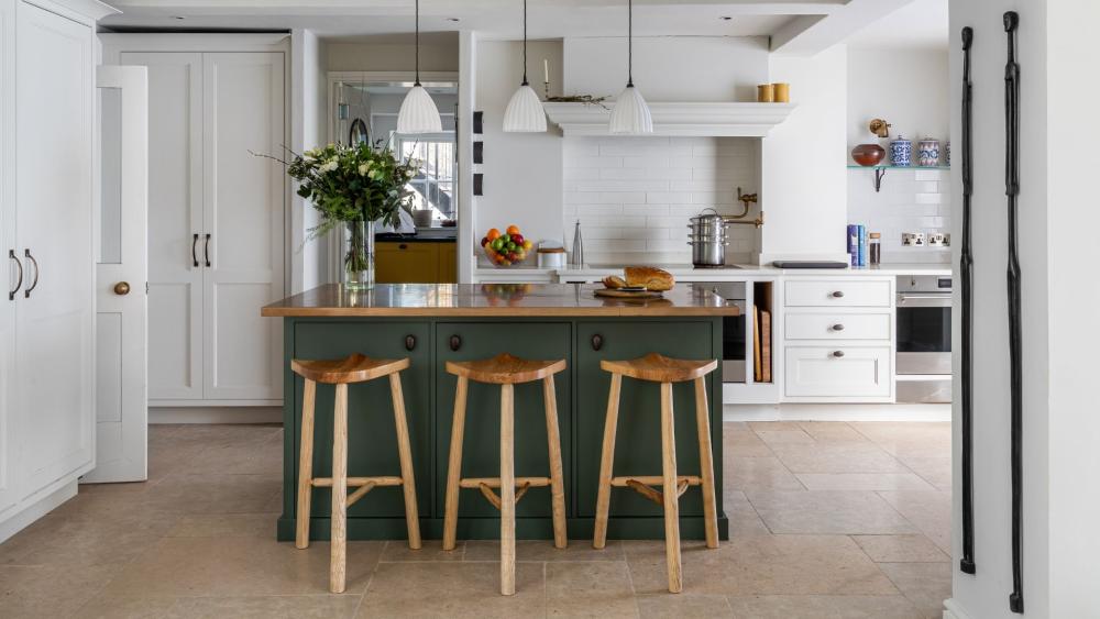
Beginning at ground level, visual weight can be created with the choice of flooring. Artisans of Devizes stone can be used to create lovely chequerboard floors and they are great for creating visual weight,’ says Sean. ‘You can also inject visual weight by choosing a darker floor with lighter furniture on top. A darker floor helps ground the room. If you choose a lighter floor, you need a rug because that grounds all the furniture or creates the balance of all the furniture with the rug. Contrast in materials creates balance.’ The scale of flooring is also important for getting the balance right. ‘When selecting a floorcovering for a large space like a hallway or a kitchen, choose a tile or a slab with a larger footprint - Artisans of Devizes has a great selection - as opposed to something that’s small. If you have a small tile and there’s lots of it, the floor can look very busy. You need to do something that is quite grand in scale. A large expanse of flooring can then be broken up with a border or detailing,’ advises Charmaine.


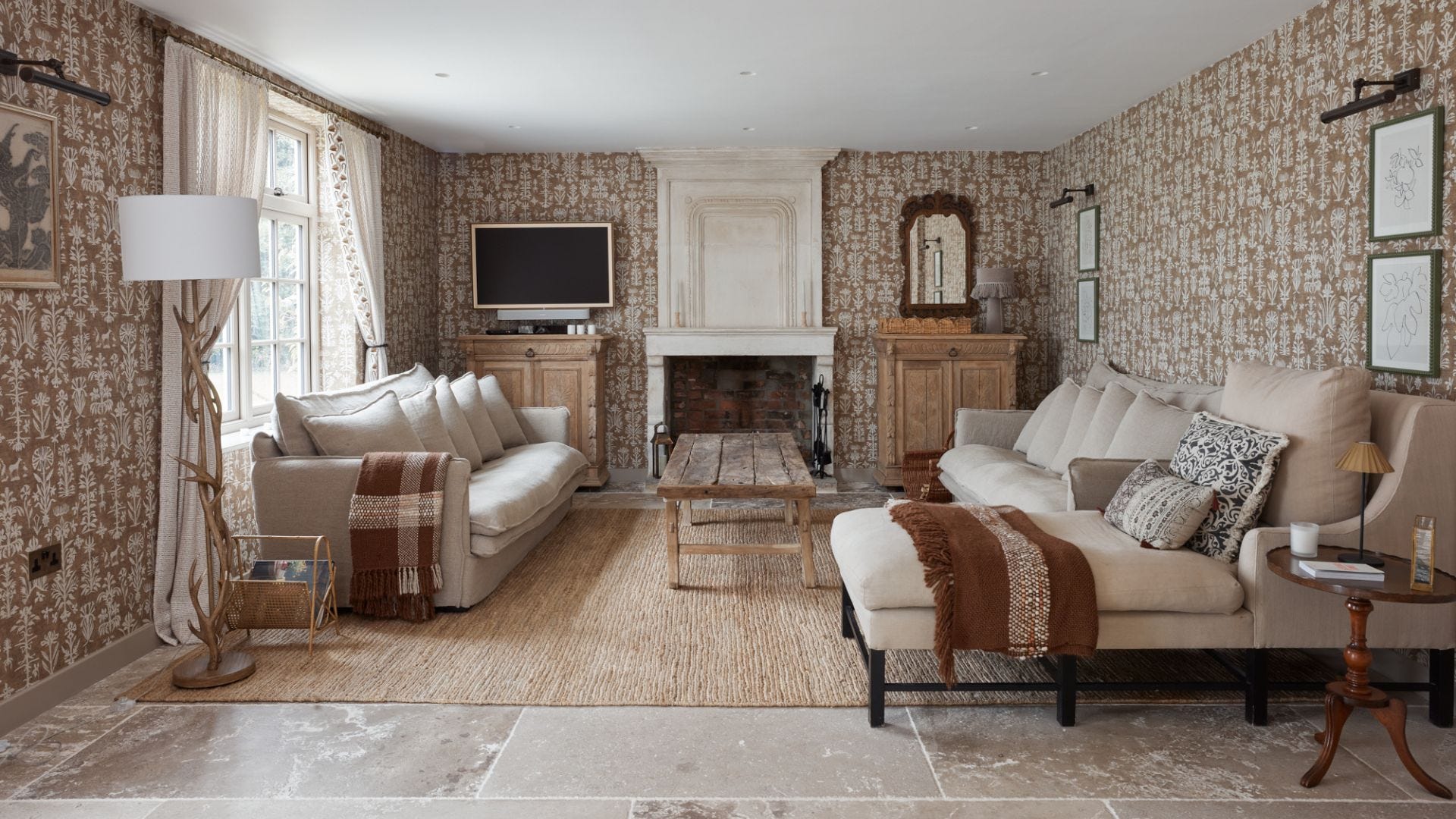
The most obvious way to create balance in a room is with a symmetrical arrangement of furniture. ‘You can introduce symmetry by flanking a fireplace with built-in cabinetry or two pieces of artwork on either side of the fireplace,’ says Charmaine. ‘For a lot of people symmetry is quite calming, it’s easy on the eye. In a lot of projects, we tend to do things in symmetry where we position two sofas opposite one another or two chairs next to one another. If you’re creating a seating area in the living room, you want social seating, so two sofas opposite one another are symmetrical, but they’re also practical and functional - you can sit opposite someone and talk to them as opposed to sitting next to them on the sofa.’
A balanced colour scheme creates visual weight and a sense of order - contrast that with a room full of clashing colours, which is likely to feel chaotic. The 60-30-10 rule is an interiors concept that helps to create a harmonious look in a room by adhering to three colours: 60 per cent primary, such as your walls and sofa, 30 per cent complementary, such as flooring and chairs, and 10 per cent accent, usually artwork and cushions. Balance can easily be introduced through use of colour in a symmetrical layout. ‘A pair of watermelon pink sofas facing each other on either side of a fireplace is a simple way of dispersing colour equally within a room,’ says Sean.
Creating an asymmetrical arrangement is a way to introduce balance in a more informal way. On either side of a fireplace, you could hang artwork at different heights, or choose mismatched chairs, such as one curved and upholstered design balanced with an angular, mixed material design. Colour can also be teased through with an asymmetrical layout. ‘A watermelon pink lamp base would look divine on a chest of drawers opposite the previously mentioned watermelon pink sofa to balance the saturation of colour within the room,’ explains Sean.


Repetition of pattern is another important factor in a scheme’s visual weight. ‘If you’re combining small-scale prints with large-scale prints, you want to make sure you hit the scale and proportion on the opposite side of the room,’ says Sean. ‘If a chair has a large-scale printed cushion on it, choose a small-scale print for your sofa.’
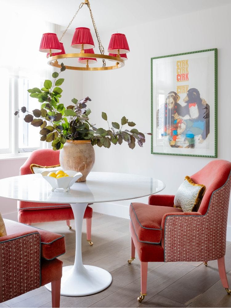
Visual balance can also be created with radial symmetry, where furniture layout is centred around one point. ‘The most obvious example of this is with a round dining table with chairs arranged around it,’ explains Sean. ‘Perhaps position a gorgeous bowl of lemons in the middle of the table and balance it with a fun colour on the backs of the dining chairs surrounding it.’


Thanks to
HollandGreen Interiors
Sean Symington of Sean Symington Design
LEAD IMAGE: Project by Sophie Thorpe Interiors
Browse our Inspiration pages for news, product launches and articles from our world of stone and tiles.